Monday 28 January 2013

Images for the Double page spread music magazine


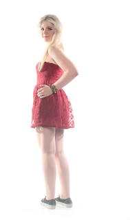
For this image I noticed that there were a few imperfection even though I had taken this image in the studio and so I decided to open this image up into Photoshop.

First, I used the crop tool to get rid of the floor that was showing in the image.

Then, I used the quick selection tool to select the background for the image and the reason why I done this is so that I can change the background from this dirty shadow background to a clean white background. When using the quick selection tool I like to use the Refine Edge tool so that the edges of my images don't have a harsh edge.

Next, I used the clone tool to get rid of the imperfections in the image and I used the clone tool to get rid of the black material that was showing underneath the model's arm. I also used the clone tool to make the model's shoes look cleaner.

Looking at the image I thought that the image looked too dark and so I used the Levels Tool (cmd+l) to change the brightness of the image. I looked at the model shoes after I had used the clone tool and thought that I could still improve the quality of how the shoes looked and so used the Levels Tool to lighten the shoes.


Monday 21 January 2013

Images for my Front Cover music magazine


For this image there was a few imperfections in the image and so I decided that I needed to open this image into Photoshop.

I used the quick selection tool to highlight the background and the reason why I want to highlight the background is so that I can change the background to a white background. I used the quick selection tool and instead of having a harsh edge around the model I clicked onto refine edge and changed the setting so the edge wasn't as harsh.

Next, I used the clone tool to get rid of any spots or marks on the models face. Also i realised that the hair on the model was coming onto the scarf, it wasn't bad however it was an easy correction to be made and so I used the clone tool to get rid of the little bits of hair.

I then moved onto the model and so decided on using the clone tool so that I could get rid of some of the imperfections for example on the chair you can see a big piece of tape and this made the image look unprofessional and so I used the clone tool to get rid f this. I also used the quick selection tool to highlight that area of the chair, I then used the Levels Tool (cmd+l) to change the brightness of the chair.

Images For my contents page magazine

For my contents I decided on using this image:


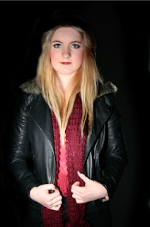
I used Photoshop to make this image look better by changing the background from shadow and grey to a dark black so that the background of the image looked more professional. Looking at the image the models hair looked too light for the image and so I used the quick selection tool and selected the hair and then clicked onto refine edge so that the edge of image wouldn't be too bold against the background. I then used the levels tool to change the colour of the image (cmd+l). I added a layer and coloured the thumb nails in black as they were chipped, which looked unprofessional and then used the effects option and selected Hue which changed the colour of the nail from chipped blue to a shiny silver. I used the clone tool to tidy the hair over the scarf and on the background and the small imperfections on her face.


The image on the left is what the image looked like before I used Photoshop and the image on the right is the image I created using Photoshop.


For the second image I used the clone tool to get rid of the small imperfections on her face and the hair which was going onto the background. I used the dodge tool to lighten the hair (fringe). I then moved onto her eyes as her eyes were not as blue as I would like and so I used the paint tool to draw over her eyes and then I used effects tool - overlay so that the colour would overlay the image below.

The image on the left is what the image looked like before I used Photoshop and the image on the right is the image I created using Photoshop.


For the third image there weren't any imperfections that came apparent in the image and so all I had to do for this image was to use the crop tool on Photoshop to crop the image down tho the appropriate size.

The image on the left is what the image looked like before I used Photoshop and the image on the right is the image I created using Photoshop.

Thursday 17 January 2013

Fonts with Commentary


Masthead

For my masthead I wanted to make something unique and different from all the other magazines and music magazine however I did realize that I needed to use the same type of conventions for my magazine. I used my research of the institutional research to look at the different magazine mastheads and it came apparent that the smaller the letters for example: NME and Q magazine, they were more popular than the likes of Imagine FX and goodtoknow Recipes. I used this fact to then start thinking about what I could do to create my magazine so that it would appeal to my audience.

At first I decided to go for something simple MRM, which stood for Music Rated Magazine. Once I had my name I needed to start researching the different font styles and so used Microsoft word and started to look at the different fonts and see which looked the best. I decided to put them side by side so that I could compare them better.

I now had the lettering and name of the magazine and now I had to look at the different font styles. I used the scroll button to look through the different fonts. I liked the look of: Bodoni MT Poster Compressed, Blackadder ITC, Blackadder ITC and Curlz MT. After looking at these I decided to experiment by placing the three different fonts together, then using the 2 of the 4 fonts and in the end I liked the Bodoni MT Poster Compressed font for the 2 M’s and for the R I used the Bradley Hand ITC.

I think this combination looked good as it would appeal to the young audience of my magazine for the long curves on the R and for the oldest of my target audience I used a formal style of text for the M.

For the colour of my masthead I had chosen a bold red colour so that it would fit into the colour scheme of my magazine as the colour scheme for my magazine is: red, black and white. Also the reason why I had chosen this colour is also because of my research as I found that several magazines that would appeal to my target audience used a red or shades or tones of red for their masthead and/or text.


Looking at this masthead I thought that I could do better and so decided to create another Masthead. I would need to think of a new name for my magazine, new font and I would have to see whether or not I would need to change the text size to fit in with the layout of the magazine.

I decided that the best plan of action was to write down different ideas of what kind of font I could use or what I want my magazine to be called and so I opened up a new Document and started to brain storm possible names I could use:

Names:

Now

NM – Now music

Real

Red

First

1st

Music

Exclusive

Report

Code


Today
2Day

The name that I decided that would best suit my magazine was 'Today!' and the reason why I think this suits my magazine is that my magazine is all about music that is relevant. Also, my magazine is all about the truth of situations, not lies that most of press make up to make people buy their magazine.


I then had to consider what font to use for my magazines and so listed them one by one so that I could see each font side by side so that I could compare the fonts better:


Cambria (body) - TODAY

Ayuthaya - TODAY

BIG CASLON - TODAY

COURIR - TODAY

DIDOT - TODAY

FUTURA - TODAY

LETTER GOTHIC STD - TODAY

LITHOS PRO REGULAR – TODAY

MENLO - TODAY


MOACO - TODAY
PRESTIGE ELITE STD BOLD – TODAY
BRITANNIC BOLD – TODAY
Gill Sans MT - TODAY

I decided to go for a simple text as I didn't want the font style to be attraction of the magazine as I didn't want the magazine to be too style over substance as the main idea of the magazine was to be an honest magazine and tell you how it is and the magazine is about telling you relevant information. The text I have chosen is called Futura and the reason why I have chosen this type of text is because the research I have done shows that the magazine genre that I am doing use this type of style of font: thin, capital letters and simple.

I then had to think about the colour of the text - use the same colour as my colour scheme? have a font different to my colour scheme? Why?

I liked the idea of using the colours in my colour scheme in my masthead and so used Photoshop to play around with the different colours for the text. First I had all red text but this looked too plain and so I used the Bucket Tool to colour in parts of the text (the dot under the exclamation mark and the 'o' from Today.

Sell-lines
After I had created my masthead it was time to start looking at the different fonts for the other pieces of text that was going to be in my magazine for example the sell-lines and the text inside the magazine and so I opened the document that I created for when I had to create my masthead so that I could see if any of them would go with my masthead.

I eventually choose Gill Sans MT - TODAY, as I felt that this style of text looked similar to the font style that I had chosen for the masthead and i wanted to have a style that slightly matched my masthead as I wanted to have a style that was consistent throughout however I didn't want to use the same text as this would give the impression that I hadn't bothered to identify the different features of the magazine and so just used the same text and this is the opposite impression I wanted to give as I wanted my magazine to look professional.

Text inside the magazine
For the text inside my magazine I have to be careful of the amount of fonts that I choose as too many fonts can detract from the professional style of the magazine and it will look over exaggerated with font and the reason why I am choosing minimal fonts is so that the different features of the magazine can be represented by the font.

The font that I have chosen for the double page spread title is going to be Lucida handwriting

and I have chosen this style as I want the titles for each page to be similar and I have chosen a quite curvy and personal style as  think this will attract the reader into reading the rest of the page/article. I wanted to use this type of font as I wanted to create a person feel to the magazine and I understand that it is not my handwriting however it does give a personal touch. Also I am using this type of font (Lucida handwriting) so that it will match the drop caps that I will include in my double page spread as I will be using Lucida Calligraphy for the drop cap because when I looked at other magazines for research, it showed that for the double page spread article it started with a drop-cap and for example NME they use similar text for the title for the article and I like the idea of using curved writing that looks like hand-writing as it gives a personal feel to a magazine.


Thursday 10 January 2013

The conventions, the producer and target audience of my text:


There are many different conventions for magazines and from my research I plan to use similar conventions for my magazine for example for the main images on the front cover, I will have a photograph of a young woman, medium shot (about waist height) and the reason why I have chosen this camera shot is because the magazines that I researched seemed to have models from medium shot (waist height) to long shot (full body). For example I found that when I was doing my research IPC MEDIA I found the magazine NME that used these types of shot (medium – long shot).  I will be using a recognisable artist for the front of my magazine as looking at other magazines you can see that magazines are more popular and will sell better if the person on the front of the magazine are well known in comparison to someone on the front cover that is unpopular or doesn’t even belong to the genre of the magazine.


For the other images in the magazine I will be using a maximum of 3 images on the contents page as when looking at the previous students work it was apparent that when using more than one image on the contents page it looked unorganised and some of the images had poor quality compared to the rest on the page, which gave inconsistently to the magazine compared to the students that only had a few images that had good quality images and that had been arranged in order. For the image on the double page spread I will be using colours that complement the house style of the magazine as I found that when looking at magazines the image looks much more though out and professional than if the colours in the image didn’t match the colour scheme of the magazine.


For the title (masthead) I will be having a simple yet professional looking masthead as when looking at other institutions magazine it was apparent that the better looking magazine where short, minimum in colour and that they use a strong colour against the background for example Q magazine use a red box with white text for the masthead, simple yet effective and memorable. The conventions for the magazine that I researched also had the masthead in the corner of the magazine usually in the top left and so I will be putting my masthead in the top left of my magazine.

For the font I have decided to go for a simple design and the reason why I have chosen a simple design is because when looking through previous students magazine the best magazines were ones tat had simple text and only a few subtle font changes for the different conventions for example the drop-cap would be different to the actual article and that text would be different to the masthead font but some people had went to the other end of the extreme by changing the style of font for every single convention and it was too much for yours eyes to take in. Another reason why I have chosen to use simple font is because the people reading it would be less likely to be attracted into reading the magazine f you could hardly read the writing and so I would like to make the text audience friendly.


I will be using informal text for my magazine, as it’s a magazine not a newspaper and so I would like to use the text style conventional for the type of media I am writing for and I would also like to use informal text so that it will make my audience feel comfortable reading instead of using words in the magazine they may not understand. I will also be talking to a ‘celebrity’ in my magazine and conventionally when having a interview for a article with a celebrity you don’t want to be too formal as you would want them to feel relaxed so that they would be more inclined to tell them more about themselves.


For the colour palette of my magazine I will be using 3 main colours and for the images I will be using accents of the colours so that it fits in the house style of the magazine and them colours will be red, white and black and the reason why I have chosen these colours is because they are popular with the genre magazine that I have chosen for example GQ magazine.


I don’t plan to change any of these things however the only reason I would change any of these conventions would be because of complications or that after completing the magazine it did not look very professional but I doubt this as I have followed the conventions of the magazine and would not for-shadow this happening. If I would change anything dramatically it would be so that it would appeal more to the audience because I have used a survey to see what my potential audiences would like to see in my magazine and most of what they have said is going to be included in my magazine but something’s could be altered to fit their preference.


If my magazine was to be distributed into the ‘real world’ I think that it would fit into many institutions but the best institution for magazine would Conde Nast as it would appeal to my audiences as Conde Nast is known for being a music, fashion and beauty magazine and even though my magazine doesn’t include beauty that could be something that I could expand on in the future.


To make sure that my kind of magazine would fit into its niche I created an online survey for people of my target audience to fill in and they described what they would like to see in my magazine. I also researched other magazines similar to what my magazine would be like and they used the same font style, colour palette and musical interest (genre) and the magazines that are similar to mine would be the likes of GQ, Q and NME. 


The target audience of my magazine will be 16-25 year olds and the occasional people that are older and younger but the main audience is around 16-25. The gender of the magazine will be more female orientated with the style of articles, artist and the little fashion content that will be in the magazine. The type of people that will buy my music magazine will be people that are interested in pop music and like to know about the latest releases, tour dates, new interviews and articles revealing all they want to know about the celebrities in the world at the minute. They will be buying the magazine about once a week as they would like to know what is currently not what happened a month ago and they would usually use this media form (magazine) to read/hear/look at new information about celebrities, new releases and etc.


Media platforms that will be interested in my magazine would be on the Television and internet as they would be able to display a little subscription box for the magazine and it will also tell you when and where you can buy this magazine from if you don’t want subscribe to it. I know that this would appeal to my audience as this is where they usually find out new releases and so this would be a great way to promote the magazine so they can find out about when, where, what and how to get my magazine.

Monday 7 January 2013

Photo shoot Planning


Media Production

Photo shoot planning document


What emotional impact do you want your photography do have upon the reader? How?
I want my magazine to have an emotional impact as I want the emotion of the images to attract the reader as well as the layout, style and content of the magazine and I will do this by giving the reader a real-life and an honest view of the articles. I will also try to give moving articles, which will help empower my readers into doing something just like the people in the article. Another thing that will consider when doing this would be making this emotion not too bold as I want it to be quite subtle, as I would not want it to feel like I am preaching to the readers.
not too bold


What personnel do you need? Who are you going to photograph?
I will be taking photographs potentially 2 people for my magazine (front cover, contents and double page spread. I will need images of two young women of around 16-18 as this is the average age of my target audience and I have picked this so that it will appeal to my audience.


What props will you need?
Props that I will need to take images for my magazine would be a chair. I will also have to consider the models clothing, jewellery, shoes and make-up.


How are you going to emphasise colour?
To emphasize colour I will use key accessories such as scarves and hats and these accessories will match the colour scheme of my magazine as the scarf will be red and the clothing will be dark or black. (My colour scheme – red, white and black)


Have you briefed your personnel/models?
I have briefed my models, as they know when, where and how they are to get to the studio, what they need to wear and what they need to do for the image.


What lighting will you need? Any other equipment?
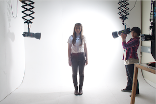
I will need at least two strobe lights and I will need 1 soft box for my lighting. I will also need a camera and a light sensor.


Where will you shoot? Will you need a backdrop?
I will be shooting my photographs in Shiney Row Colleges Photography Studio and I will be using the colleges white backdrop for the images in my magazine.


Make-up? Costume?
I will be using minimal make up however the make-up I will use for the models will be a used as a statement for example the red lips and blue eyes. I will not be using any particular costumes.

The Reece - Questions


the ‘recce’


1.    Are there any potential hazards that could pose a health and safety risk where your photo shoot will take place (trailing cables/traffic/other objects)?
There are a few potential hazards that could pose a health and safety risk would be wires (as there are a few wires from the fans) lights (the lights get extremely hot when in use so that could be a potential hazard, props (there are a  lot of props in the studio for people to use however the majority are on a stand however if not put away correctly people could trip over them in the dark conditions possible drink or food as it could be spilt which could cause a health and safety risk as someone could slip on the food/drink.
2.    What will you do to ensure these risks are minimised?
To ensure that there are minimal risks when taking my images so I will make sure that the food and drinks are not used throughout the picture taking process.
3.    Will the time of day/weather affect the outcome of the photos? Have you allowed for this?
I am taking my images inside and so the day and weather will not affect the outcome of the photos however the amount and angle of light will affect the outcome of the photos and this will be down to me as I will have full control over the limit of light is in the image.
4.    Have you considered the background to your photos, particularly if taken outside? How will you ensure you will get the background you want?
For the background of my images there will be a studio backdrop, either black or white and I have used this so that it will make the image look more professional. I will make sure that the background is in my image by using a big white background and keep checking the down the lens to see if the backdrop is still in the image.
5.    Have you considered lighting? What about the ‘problems’ of natural lighting, either outside, or streaming through a window? Will you need to use a flash? Have you considered reflective objects that might spoil the effect?
I will be using indoor lighting with professional studio lighting. There is a very low chance that any natural light will spoil the image as there are no windows in the room except behind the camera which leads to a room which usually has it’s light off any way (there is also a black out blind to block all the light).
6.    Do you need permission to take photos in the place/venue you have in mind?
I don’t need permission to take the photos however I will need to book the studio so it would depend on the booking schedule but I wouldn’t see a major problem as there are two studios.
7.    Do you need to book time in a room (e.g. the photography studio at Shiney)?
I do need to book time in the studio (at Shiney Row College) however if the studio is fully booked I could book a camera out and take some images at a different location and if that also fails I could use my own camera.
8.    Are other people/crowds likely to be an issue for you? What have you done to ensure that it will not spoil the effect?
Other people in the image is not really going to be an issue for me as the people that will be in the room will be away from the camera space or behind the light. To ensure that they do not spoil the effect I could ask them to move or use the free studio time to take my images when there will be nobody else there.
9.    Are you reliant on lifts/props/friends’ equipment/models? How have you planned that these things will come together at the appointed time? Plan B?
I will be reliant on the model that I have chosen and if that person does not turn up there other people I could ask or even schedule for another day as I plan to do it early on just in case something bad may happen.
10. Finally, have you thought of every eventuality…?
I will not have to worry about the weather as I will be inside, I will have to think about the props I use as I will be using the colleges props however I will be using a chair and I’m sure there will be a chair somewhere in the college. I have got a back up plan just in case the equipment doesn’t work as I could wait until they are repaired (as I plan t take my images in advance weeks before they need to be ready) and the model I have in mind is reliable but if they don’t turn up there is other people there that is willing to take an image or if the worst comes to the worst I could re-schedule to a later date.