This is what my front cover looks like now (left image) and to the right of this is how my magazine looked last year. As you can see there are only subtle differences this year compared to last, no major changes. I have changed the image used, changed the colouring for the sell-lines from black and red to white, added a little bit more text for the main sell-line changed the font for it also, got rid of the website information, moved the date onto the '!' as when researching I thought it looked good in the YOU magazine and the last element I changed from the last time was that I changed the colour of the 'O' for 'TODAY' and the'.' for the '!' from black to white. I feel I have kept the layout of the magazine as elements of the magazine have only been slightly changed/moved and the colour changed. I feel that this change makes the magazine a lot easier to read as the white background was just too plain looking back I feel I should have added a colour to make it look too drab.
 The image on the left is what my contents page looks like now with the improvements and the image on the right is what my contents page looked like last year. I have kept the same layout in sense as I have kept the main image in the same place, used the same size images for the smaller articles but added an extra article, added how to get in touch with the magazine including social networking, I have just used a list of names and page numbers rather than a few names and a little bit of information on each, I have changed all of the images and finally I have got rid of the word contents and the masthead and instead got the words 'In this issue'
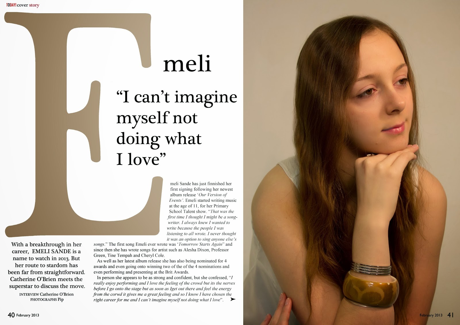

The image on the left is what my double page spread for my music magazine looks like now after the alterations and the image on the right is what the double page spread looked like last year when I handed it in to be marked.Layout wise nothing too dramatic has changed in the sense that the image is on the right and the writing is on the left and the article is about the same person, but I think after that the similarities change completely as I have included a massive 'E', the colour palette has changed, not because I don't like my colour palette but you don't always have to conform to your colour palette when it comes to the double page spread as this is where your artist/model needs to shine through and so matching the colour palette to what the model is wearing is something that makes the double page look different compared to the rest of the magazine


No comments:
Post a Comment