In this blog I will be showing how I created my contents page and I will also include the reasons why I used certain things.


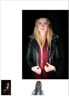
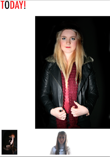
When creating my contents page I thought that it would be a good idea to place my images in first and then add the text around the images. I decided to lay my images out in the same way I have done in my flat plan. Next I added the masthead that I had created, again in the same place I had stated in my flat plan. I added these images onto Photoshop using the move tool.
After adding in the images into my magazine I added a black box at the side of the images to act as a border to the sub-headings. I used the Rectangle Tool and I had got this idea from my research for contents pages. I started adding different artist names into the boxes that I created using the Horizontal Type Tool. I changed the colour of the two artist name, one to red and one to white. I used them colours as they are my colour scheme. I tried using these colours to see which colour looked the best on the black box border.
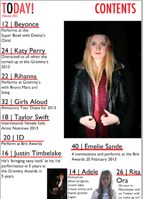
I decided that neither colour looked particularly appealing and so I got rid of the black box and changed the text colour to black. I then wrote the other artists names and the captions underneath. After I decided that it looked to plain and they needed to have a little more structure to it and so I used the Rectangle Tool to draw a red line underneath all the artists names.
I carried on using the same format of adding more artist names beside the two images along the bottom, adding a caption underneath their names and then write a page number at the beginning of the name.
Looking at my magazine after creating it I realise that my design from my flat plan has altered slightly as my sell-lines along the left hand side has went a little bit longer than I expected and because of this the images and their sell-lines has had to move along slightly. But other than than my flat plan has turned out as well as expected.
After getting most of my magazine finished I decided to look at my magazine again to improve it further and so I decided to add a few more details on the contents page. I used the information from the front page of the magazine to add the issue date and I also decided to add a title for the page and so labelled the title 'CONTENTS'. I used the Horizontal Type Tool to add the text into the page. I used the Futura Text to match the masthead of the page.
I thought that the ordering of my magazine made the main ell-line a little unclear , as I placed the main sell-line at the top of the other sell-lines but it still wasn't clear and so I decided to make the main image smaller and move the main sell-line underneath. I then moved Justin Timberlake sell-line as this was getting pushed to fit into the part beside the main image and so moved it down to the body. I also decided to change the numbering of the contents page so that they were in numerical order. Which is more conventional and more professional as you will see them in order rather than all in what seemed to be random ordering.I thought that the layout of the magazine didn't have the consistency that I was going for and so I used the layout that I had originally go with my using the move tool to move the images and text over and I also used the Horizontal Text Tool to move the sell-lines up.
I then thought it would be a good idea to change the colour of the 'O' on CONTENTS.
After looking at the page as a whole I thought that the main image of this page is a little misleading as you are not really sure if the sell-line underneath goes with the image above and so I decided to add a little caption underneath to help the audience to see that the two relate.


No comments:
Post a Comment