Thursday 14 February 2013

Contents Page Construction


In this blog I will be showing how I created my contents page and I will also include the reasons why I used certain things.


When creating my contents page I thought that it would be a good idea to place my images in first and then add the text around the images. I decided to lay my images out in the same way I have done in my flat plan. Next I added the masthead that I had created, again in the same place I had stated in my flat plan. I added these images onto Photoshop using the move tool.


After adding in the images into my magazine I added a black box at the side of the images to act as a border to the sub-headings. I used the Rectangle Tool and I had got this idea from my research for contents pages. I started adding different artist names into the boxes that I created using the Horizontal Type Tool. I changed the colour of the two artist name, one to red and one to white. I used them colours as they are my colour scheme. I tried using these colours to see which colour looked the best on the black box border.
I decided that neither colour looked particularly appealing and so I got rid of the black box and changed the text colour to black. I then wrote the other artists names and the captions underneath. After I decided that it looked to plain and they needed to have a little more structure to it and so I used the Rectangle Tool to draw a red line underneath all the artists names. 

I carried on using the same format of adding more artist names beside the two images along the bottom, adding a caption underneath their names and then write a page number at the beginning of the name.

Looking at my magazine after creating it I realise that my design from my flat plan has altered slightly as my sell-lines along the left hand side has went a little bit longer than I expected and because of this the images and their sell-lines has had to move along slightly. But other than than my flat plan has turned out as well as expected.

After getting most of my magazine finished I decided to look at my magazine again to improve it further and so I decided to add a few more details on the contents page. I used the information from the front page of the magazine to add the issue date and I also decided to add a title for the page and so labelled the title 'CONTENTS'. I used the Horizontal Type Tool to add the text into the page. I used the Futura Text to match the masthead of the page.
I thought that the ordering of my magazine made the main ell-line a little unclear , as I placed the main sell-line at the top of the other sell-lines but it still wasn't clear and so I decided to make the main image smaller and move the main sell-line underneath. I then moved Justin Timberlake sell-line as this was getting pushed to fit into the part beside the main image and so moved it down to the body. I also decided to change the numbering of the contents page so that they were in numerical order. Which is more conventional and more professional as you will see them in order rather than all in what seemed to be random ordering.


I thought that the layout of the magazine didn't have the consistency that I was going for and so I used the layout that I had originally go with my using the move tool to move the images and text over and I also used the Horizontal Text Tool to move the sell-lines up.

I then thought it would be a good idea to change the colour of the 'O' on CONTENTS.

After looking at the page as a whole I thought that the main image of this page is a little misleading as you are not really sure if the sell-line underneath goes with the image above and so I decided to add a little caption underneath to help the audience to see that the two relate.

Colour palette


The top row is the colour scheme for my magazine. I decided to look at other colours of tones from the colours that I had chosen so that when I came to put magazine together I had thought of every possibility of colours that I could used.

For the four colours that I had chosen I liked the idea of using different tone of the same colour: black, grey and white. However I needed to chose a colour which would attract attention to the magazine and so I looked at the colour palette above to help me decide what colours to chose from. I also looked at other professional magazines of similar genre to look at what they had chosen for their colour schemes to help me decide.

Photographs Choice

I had taken several images images of three people and I had to use three different shoots to do this.
Here are the a sample of the images that I had taken on the three different shoots:
For this photo shoot I decided to experiment with different lighting. For example the first 6 images I decided to light up using a torch light and this looked too dark and so I started to use the studio lights however the first 2 images looked yellow so I had to change the setting again until I created a white background. I then used  a combination of the light from the torch and then I used a gel to colour the light a yellow colour. Looking back I should have used a colour which was in my colour scheme. I decided that I should use the one image that had the professional white studio background. I placed the image into Photoshop and I realised that I needed to crop the lights out of the image.

For the first 4 images the images are quite dark and the reason for this is because I was changing the camera and light setting so that they were set on the correct level. I then had the correct lighting and now it was just a matter f getting the correct pose. I ended up choosing _MG_0468.JPEG as I liked the light on the model and the position that the model was in. I also think that the model looks really relaxed which is the conventional thing when choosing images for the contents page so the reader looks intrigued into reading it.
For the first 8 images the images have been more or less evenly bright however this was the opposite of what I wanted as the first image that I had created was low key and so I want to use at least 2 low key images. I decided to go with one of the 4 images which had a black background and was a low key image - IMG_0061.JPEG. The reason why I used this shot as it looked quite intriguing, because why is she looking away from the camera? Which I hope is something that will make the reader want to read that particular story.

Thursday 7 February 2013

Front Cover Construction

In this blog I will be showing how I had created my front cover and I will also include the reason why I used certain things.


This is the Move tool and I will be using this tool to re-position the images, boxes and text.

This is the Horizontal Type tool and I will be using this tool to type up text and place it onto my work.


For the image on the left I used a big size of text and as you can see this text is on top of the image and this doesn't look very professional.
For the image on right I got a hold of the masthead and then dragged it behind the layer with the model on it.
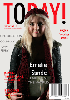
In this image on left I used the Text Gill Sans MT to write the sell-lines. I chose to use red text so that it would match the masthead and the colour scheme. Next, I added the essesntial information and the main sell-line.
Looking at the colouring of the text, I thought that it looked too red and I wanted the main sell-line to stand out more rather than the sell-lines beside it and so I decided to change the colour of the main sell-line. I got my inspiration from looking at my research and deconstruction  of front covers and so used the colours white (as this was part of my colour scheme) and grey (this may not be part of my colour scheme however I think that if I were to use black it would blend into my models jacket and so used the same tone colour - grey).

I then realised that I needed to add my text underneath the bar code and so I used the Rectangle Tool to draw a bigger white box instead of stretching the bar code. I used the Text Tool to add the price and I also had to use the text tool to change the font to arial so it looks similar to the style of font used on the bar code as it was set to a default of Gill Sans MT (image on the left).

After creating my bar code I felt that the front cover looked too white and little blank and so to tackle the whiteness of the magazine I decided to change the colour of the background of the magazine. To change the colour of the background I added a new layer.


I then clicked onto the Rectangle Tool and drew a box over the whole of the A4 front page, first making sure that I had used a grey colour as this colour is part of my colour scheme.


I then looked at the colour of the magazine after I added the rectangle box. I decided that this was too dark and so I double clicked on the layer which opened a list of options to change for the rectangle layer. I changed the opacity of the layer so that it was a little lighter.


After changing the colour of the background this altered how much the text stood out on the front cover and so I decided to change the styling of the text. I double clicked on the text layer and the layer style box appeared. I used the tools available to make the text stand out. I change the opacity from 100 to 58, the spread from 0 to 10 and then the size from 0 to 5 and click OK. Underneath the layer style box is what the text looked like before and after the alteration.


After changing the style of the text it still didn't seem to stand out very well against the background and the image and so I decided to try another method. I selected the text and then used the basic tools available along the top when you select your text. I changed the options from normal to bold. I changed the artists name to bold so that would be the first thing people see and then they would read the small caption underneath.

Next, I decided that the front cover was a bit too bare and so i decided to add some more sell-lines onto the front of the magazine.I used the same colour of text that I used for the other sell-lines that I already had on the page.


However, looking at the composition of text, it looks a little messy the way in that it has been arranged and so I used the Move tool to re-arrange the text. I arranged the text so that it got shorter instead of overlapping onto the image so that it would frame the image. I then decided that the red on the front cover was over used and nothing was really standing out and so I used the text tool to change the colour of the text from red to dark grey. The reason why I have chosen dark grey is so that I use my colours in my colour scheme and so that my magazine is consistent.


I decided that the "Free Voucher inside' offer would not really appealing to the audience in the style that I have used and decided that it would be better if I were to take the offer off the front cover by using the delete button at the bottom right hand side of the layers panel.

I the decided to move the Issue Date and the website details (essential details) from the left of the model to the right, so that it fills the gap. After doing this it made the other side look a little bare and so I decided to spread the sell-lines in grey out so that it filled the gap a little more using the Move Tool.
                                                   
I changed the layer style by changing the text by adding a drop shadow under the text. I changed the drop shadow from 0 to 5 for all the sell-lines on the left hand side.

I then changed the size of bar code as I thought it was taking up too much space as it was overlapping on top of the model. I sued the move tool to highlight all the layers of the bar code and then used the transform tool to make the bar code smaller.


I then changed the style of the text from the main sell-line as I thought it looked a little basic and so decided to use the same style for the double age spread text Lucida Calligraphy and I used drop shadow for the main sell-line.

I then decided  on adding the issue date on the front page as I was going to put it somewhere else in the magazine but after think ing about it more I think it would be more conventional putting it at the front.

After adding the Issue date at the top of the magazine with the rest of the essential information I noticed that it made the ordering of the information looked unprofessional as they were not inline and so decided to move the Issue number down to the bottom beside the bar code and the cost.