In what ways does your media product use, develop or challenge form and conventions of real media productions?
Introduction – discuss key features – cover lines, pull quotes, masthead location
When creating my magazine I had already done some research into where key features should go in a front page, contents page and a double page spread (link to Powerpoint Presentation - Deconstruction of 3 Music Magazine Covers Blogger). In this deconstruction I highlight the key features in what it takes to make a front cover. After getting enough research into what to expect in a typical magazine, I then looked at the institutional research to see which magazine would best fit my genre and my target audience. (Link to Institutional Research) Then using all the research I have collected and then presenting it onto my blog I decided to create a flat plan to outline where I should put the key features of my magazine. (Link to Front cover, contents and DPS flat plans with written rationale).
(1) For the masthead of my magazine I think that this is quite conventional to most mastheads, and the reason to why I think that is because mastheads that are similar to my genre, as they have thin text and they use contrasting colours: red, black and white, which I have used in my magazine and have used the same colours to my masthead, throughout my magazine to keep consistency in my magazine.
When creating my masthead I had to think about the scale of the image (masthead), as you didn’t want the masthead to be too overpowering on the magazine, as I wanted an equal amount of imagery and text and I also wanted the content to also help people want to buy the magazine.
When deciding on where to put the masthead I decided to try out the different positions on the page to see where the masthead would look best.


(2) This image fits in with the conventions of magazines as this image is smaller that the main image, typical of this image and layout. The connotations of this image would be that she is happy and she is looking forward to the future and I think this because the model has her head up to the ceiling. This doesn’t really fit the conventions of normal magazines as images used in the magazine usually have the model looking straight at the camera, so that you know who the person is instead of having an obscure view of the ‘celebrity’. The connotations of this image would be that she doesn’t want to be noticed that much and would like to blend into the background however she has red hair which could possibly be that she was in the shadows is now slowly coming out into the spotlight. There is also a lot of attention around the model’s face, as there is a lot of light on her face compared to the rest of her body and this would suggest she is more recognized from her face than anything else.
(3) This image fits in with the conventions of magazines rather than the previous image (2) as the model is looking directly at the camera and this is the normal convention of a magazine because the magazine would only put the image in the magazine because they think the magazine will sell better with their ‘face’ in the image. The denotations of this magazine would be she may want to blend into the background as she is wearing a white top, the same as the background; however she is wearing a sparkly collar and necklace which would suggest she has some confidence.
(4) This image fits in with the conventions of a magazine as the person is looking at the camera, the image is from waist height however the image is quite dark and may not look very conventional to a ‘real world’ magazine. The connotations of this magazine is that she is conflicted with confidence as she is wearing a black top, the same as the background however she is also wearing a red scarf which suggest she is quite bold.
(5) This image is similar to the previous image (4), in what the model is wearing however the connotations and the denotations are different all because of the lighting and the background. The denotations of this image would be that she wanted to stand out from the ordinary, using the white background as plain and then using the textures from her coat and accessories, these things are also quite bold in style and colour which would suggest confidence. Also the fact that she is siting backwards on a chair suggest that she is a little cocky and cheeky and this is seen al by the way she has been positioned. The connotations of this image would be that she is looking straight at the camera with ease and confidence.
(6)This image is probably a lot more interesting than the other image all because of the positioning and the clothing used in this image, as the connotations of this image would be a person twisting her body around to look at the camera, and the denotations of this would be that she is twisting her frame towards the camera and yet her body is facing the other direction suggesting that she is teasing the camera. She is wearing a very bold red dress which would suggest she would like to stand out from the crowd and likes to be noticed.
(7) I decided to use this font as I thought that this type of text fitted in with the normal conventions of masthead’s for music magazines that match my music genre - POP, as they follow the convention that they are thin and long, which I think this text does. When deciding on the different font styles in my magazine I made a list of the different choices of text I could use.
Cambria (body) - TODAY
Ayuthaya - TODAY
BIG CASLON - TODAY
COURIR - TODAY
DIDOT - TODAY
FUTURA - TODAY
LETTER GOTHIC STD - TODAY
LITHOS PRO REGULAR – TODAY
MENLO - TODAY
MOACO - TODAY
PRESTIGE ELITE STD BOLD – TODAY
BRITANNIC BOLD – TODAY
Gill Sans MT – TODAY
Lucida Calligraphy – AaBbCc
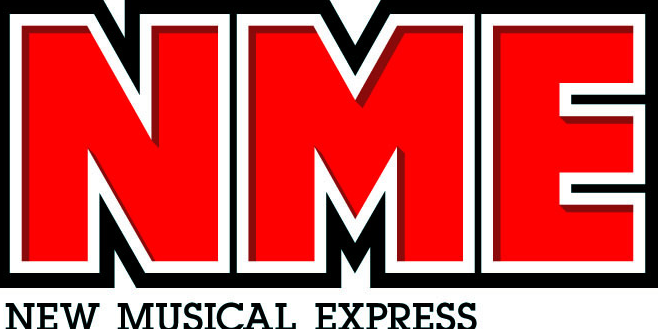
(8) I decided to use this font Lucida Calligraphy, as I thought that this type of font would look professional, I had got this curvy text inspiration after looking at ‘real-life’ magazine, on a double page spread from NME magazine. I thought that this font would appeal to all of my target audience because it had already worked for a magazine that has a target audience the same as mine – 16-25.
(9) I decided to use this font as I thought that this style of font is easy to use and would appeal to a large amount of reader because of this, as I am using this font for the main content in my magazine and have found from my own preference and personal research of double page spreads that magazines tend to use a simple font with not a lot if not any special tails etc. in the font.
(10-11) For the content and layout used in my magazine I tried to keep it looking professional by using the same amount of space between each sell-line on the contents page and again on the double page spread for each section of the article. I also used the same house throughout the magazine to keep he magazine looking consistent. Consistency is another convention in a magazine as people like reading things when the layout and format are simple and easy to read and the same on each page.